“Wherever you go, there you are.”
― Buckaroo Banzai
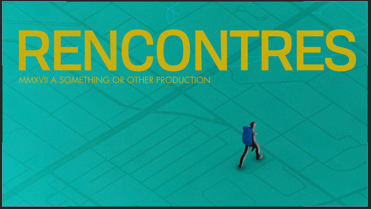
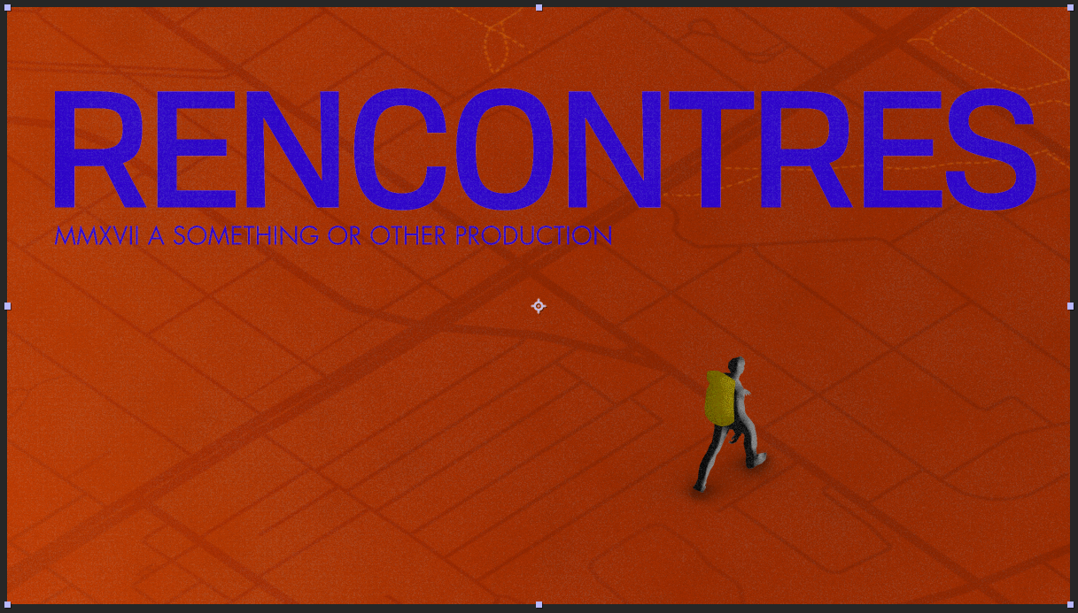
Opening main titles for Recontres
I was contacted by Bell media in late 2017 to create a title sequence for their new French language television show. I was given a Carte blanche to make whatever I wanted so long as it evoked the style and feeling behind the show itself. The show was centered around components of geographical explorations and the personal interconnections made between various people you meet when exploring a city. Touchpoints of highly graphical 70’s style title sequence and geography were the initial starting points for this build
Touchpoints of highly graphical 60’s and 70’s style title sequence and thematics surrounding geography were the initial starting points for this title I began my exploration by looking into old maps from the city around that time period as well as looking at early film title sequences and design from that era
A huge initial inspiration came in the form of the early work of Graphic Designer Saul Bass.
The Concept
Conceptually we aimed to visualize a protagonist of the story walking around and exploring while encountering various people along their journey.
We wanted to achieve this as abstractly graphicly as possible, while still paying geographic homage to the City of toronto (the city where the series takes place) without going too ham with obvious landmarks.
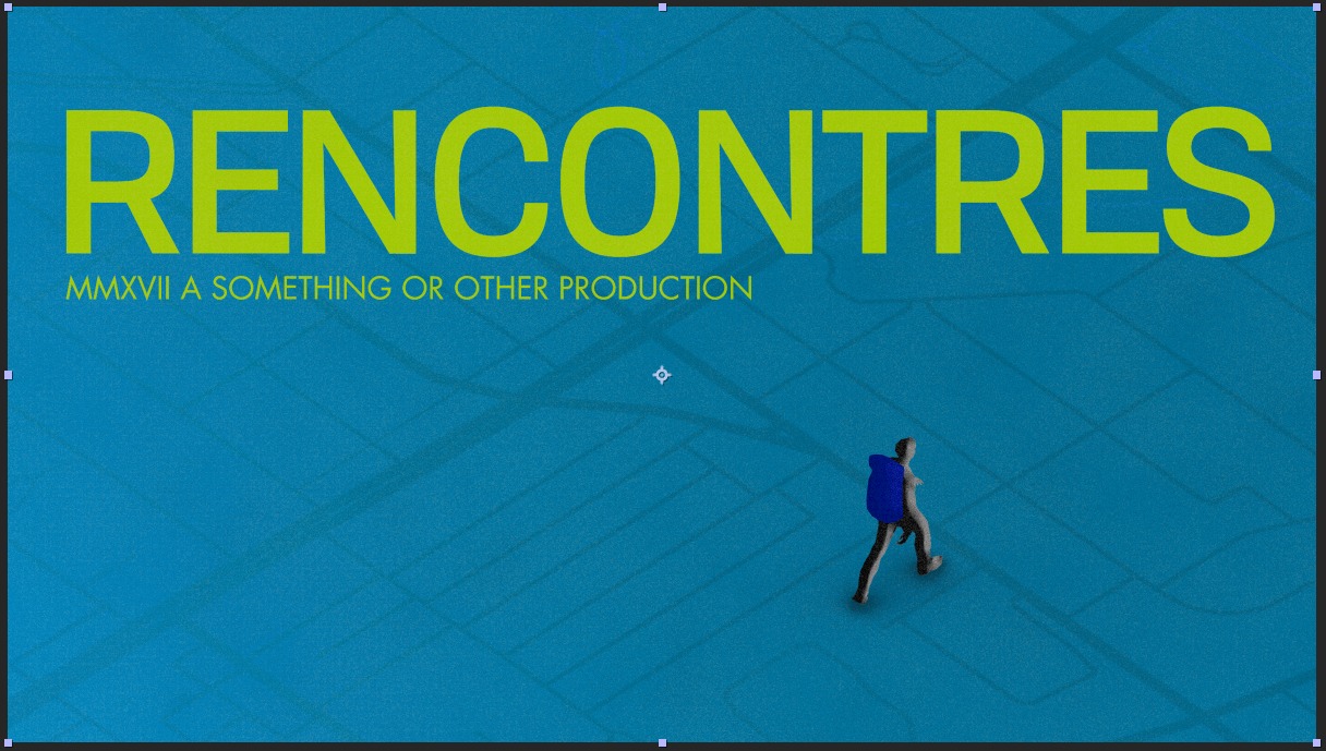
We abstracted the sense of the city into the maps in each scene that are stripped down aerial projections of major roadways and parks.
The overviews are less obvious with their content and markers removed so additionally we placed some recognizable public transit for the city in there as well. (because everyone loves the TTC!)
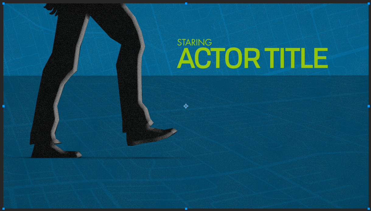
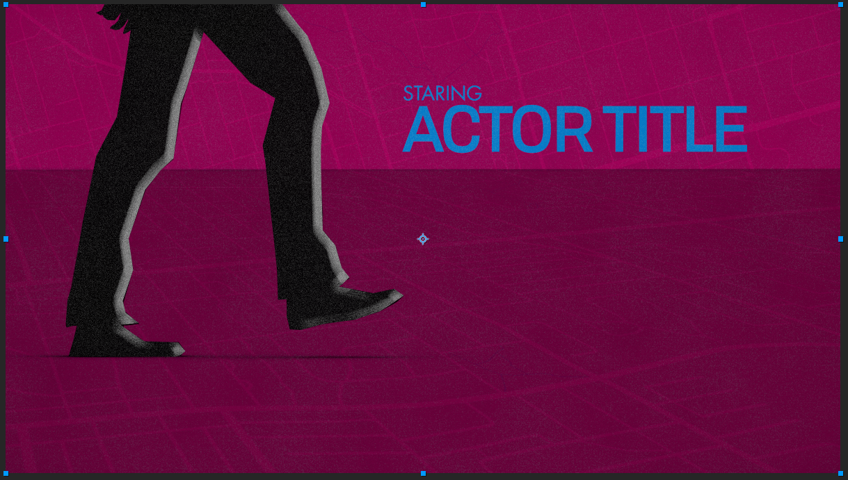
Some early layout and color palette explorations
I always wanted a opportunity to play with this highly textural graphical flat style and to figure out a way to reinterpret this style in a way that wasn’t fully frame by frame animation (which is certainly how they did it in the old days) This however presented quite a challenge coming from a 3d workflow standpoint (though I am no stranger to frame by frame classical animation) the timeline and budget for this sequence did not allow for the long route (about 2 weeks of development time in total) So we needed to figure out a way to approximate the same choppy feel and almost screen printed noise patterns of these classic title sequences without going too over the top and spoiling the subtle aesthetic
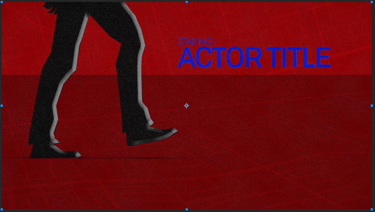
First thing I got together was a mocap walking figure on a walk cycle loop., by decimating the character to give a more low poly and angular look and feel I discovered that this ended up producing a sort of highly illustrative “saul bassy” style abstract silhouette.
Obligatory Compositing Breakdown
By utilizing isometric 3D camera angles and very flat unlit graphics, combined with a separate material channel for each layer, we were able to output passes of each colour/layer with a transparent channel that would allow us to add specific noise and grain effects to each colour layer
After compositing and aligning all the layers to produce a 16 Frame per second look (to make everything feel like it was more classically animated) we set to building out the type reveal sequences and general type setting for the rest of the sequence.
Creative Direction - Lee James Ormerod
Title design & animation - Lee James Ormerod
Music - The Boss Music by Jean-Claude Pierric
Agency - Coup D’etat
Producer - Jean Benoit Lauzon
Thanks to - Bell media and Greenlake Films


